The Art of 404 – Being Creative in Your Errors

During the past few years the 404 error pages have been slowly but surely taking over the Internet and today they are a pretty important part of our websites. They have become somewhat of a new form of art if you will...or maybe just a really, really well-taught marketing strategy. Either way, if you have a well developed, funny, and interesting 404 error page, instead of the plain old boring error text, chances are that the visitor may just stay a while longer and maybe browse through your content a little more. Not only that but if your 404 page is interesting enough, people will share it on their social media platforms for all of their friends and followers to see. A well done 404 error page might bring you a lot of traffic, which in turn may gain you lots of popularity. Don’t get me wrong, your website has to be in a good shape as well, but if you play your cards right you could be headed in the right direction.
We have compiled a list of what we believe to be quite interesting and funny 404 error pages among giants such as NASA, Linux and so on, so you could take inspiration from them and maybe come up with something even greater.
1. Canva
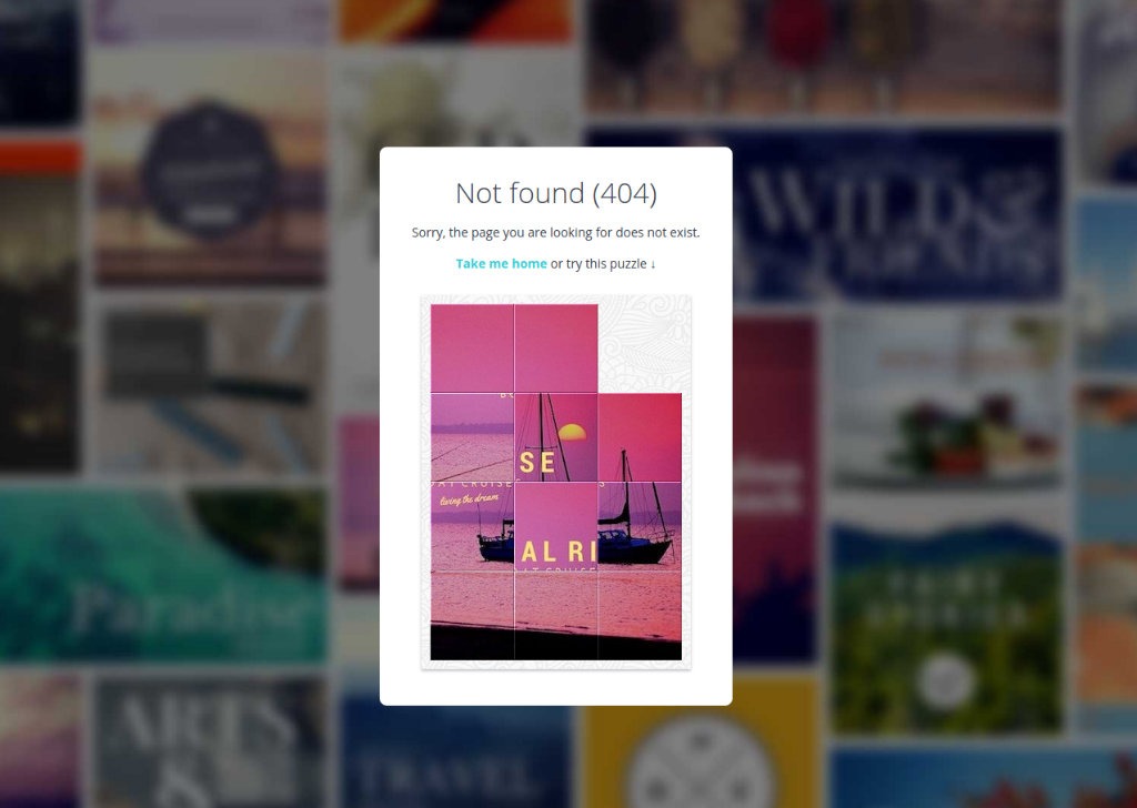
As you can see on the image bellow, the people from Canva have chosen quite a creative approach. They have managed to keep the user engaged by integrating a puzzle game on their error page, which is straight forward innovative thinking.
2. Airbnb
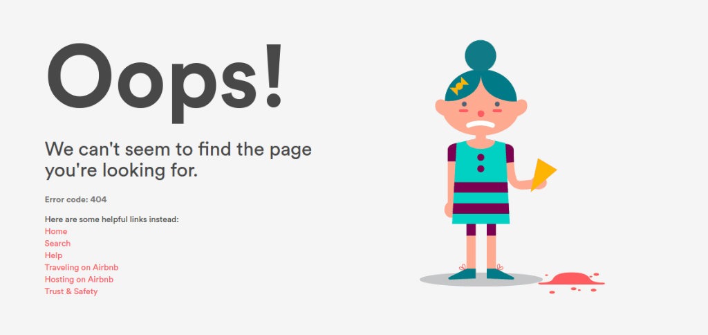
If you somehow find yourself on to the Airbnb 404 error page you will see a sweet little girl dropping her ice-cream on the ground. It is a nice change from the static pictures we are so used to seeing on those types of pages and describes perfectly how we feel – a little bit disappointed.
3. MailChimp
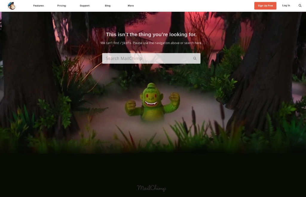
While this particular error page is neither dynamic nor interactive, you can still notice that there is a thought put behind it. You might even say that you are completely lost in the jungle.
4. Blizzard Entertainment
Here you face the particular sense of humor Blizzard are known for. They manage to stay fresh, yet true to themselves at the same time.

5. NASA
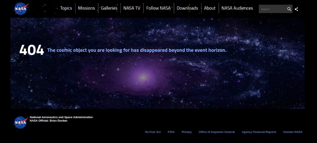
Even the people from NASA have decided to include a little humor in their 404 Error Page. While some would say that the image is nothing special (if you really think interstellar objects are not worth looking at), the text is definitely NASA-funny.
6. Spotify
We do realize that the transition from NASA to Spotify is less than subtle but we are on a 404 error page hunt, so bear with us. Here you are faced with some visually pleasing picture and a witty text. What’s better than that!

7. Tumblr.
While this particular page is not very easy on the eye it still has a lot to offer. You have lots of constantly moving graphics and a funny text, which to be honest is right on the spot.

8. IMDB
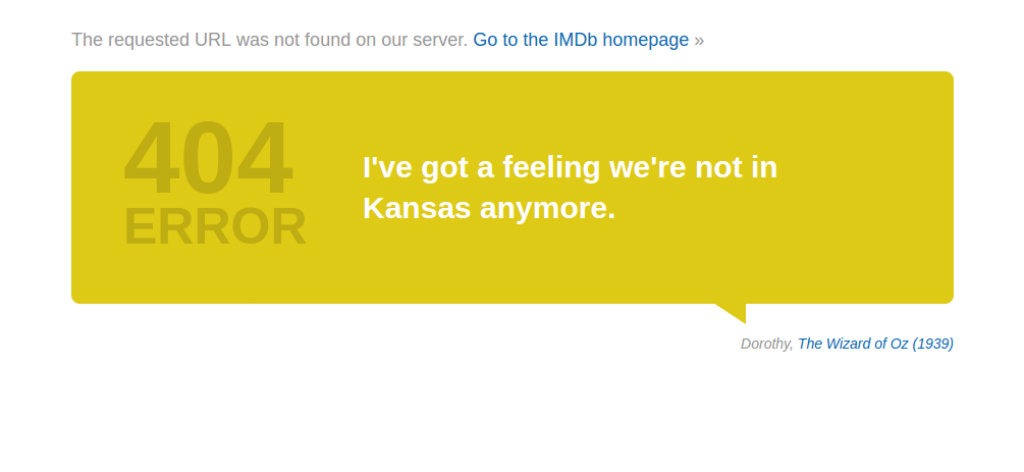
The Internet Movie Database, on the other hand, has a simple but interesting approach. They rotate notable phrases that we’ve heard either from TV shows or from the big screen. It’s simple, to the point and makes you want to refresh, just to see what quote will pop up next.
9. LEGO
Simple, yet not boring. This best describes the LEGO 404 page.

10. Linux
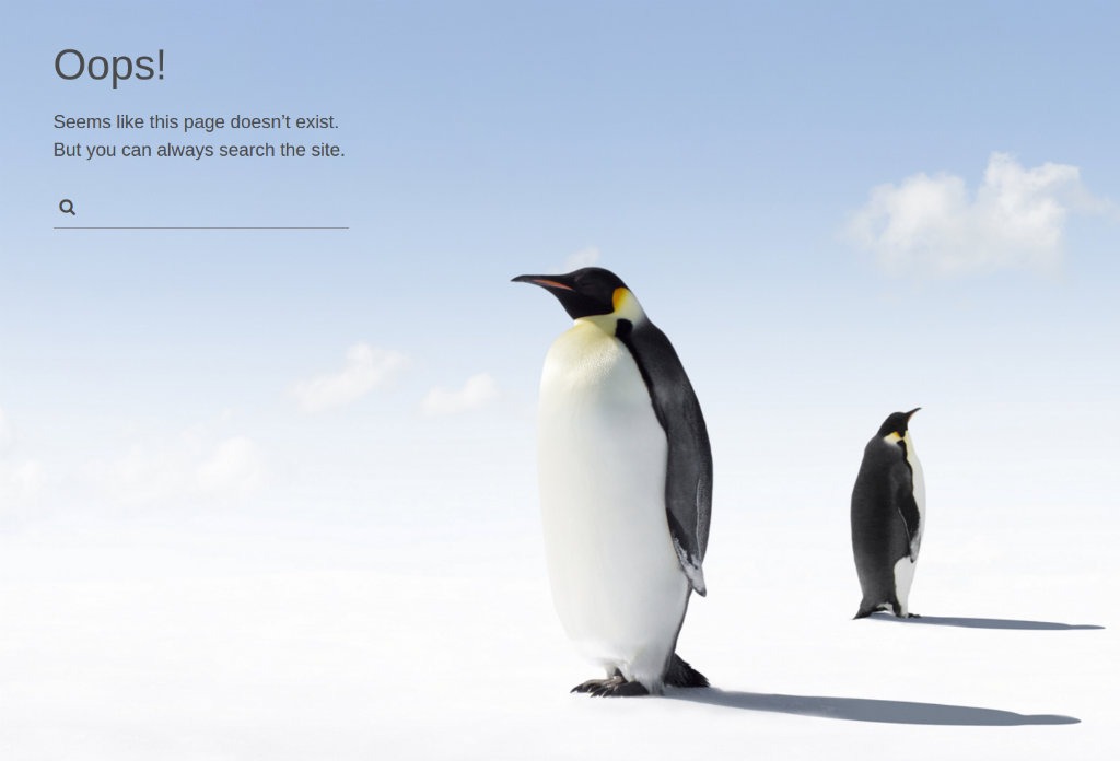
Again a simple, yet interesting error page, which represents what Linux is all about.
11. cPanel
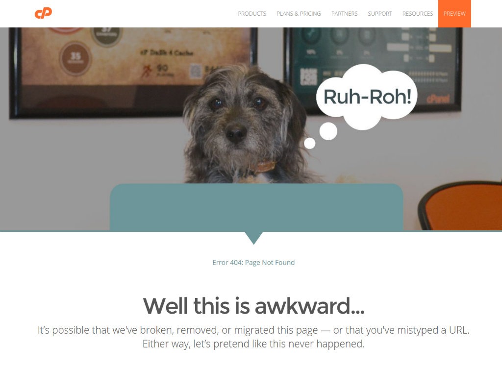
The last three positions in our list, we have saved for the furry mascots. Let’s face it, it’s always funny to stumble to an error page only to be greeted by a furry friend with a friendly face and a cute comment.
12. Cloudsigma
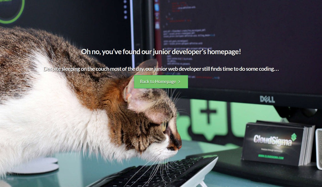
To be honest, as a cat-lover, I am a little bit disappointed to report that this was the only 404 error page with a cat which I was able to find. And I thought that the Internet was ruled by cute cat images with mittens.
13. The Huffington Post
And last but not least we have The Huffington Post’s 404 error page. The picture is cute and with a funny comment above. Makes you want to stay for a while and look at the doggy while deciding where to surf off next.

We hope these examples served you well and gave you the much-needed inspiration for your own piece of art also known as the 404 error page. And if you already have the perfect 404 page but are in a desperate need of a premium web hosting provider, then look no further, because ETNHost is the right fit for you!


